
Introduction
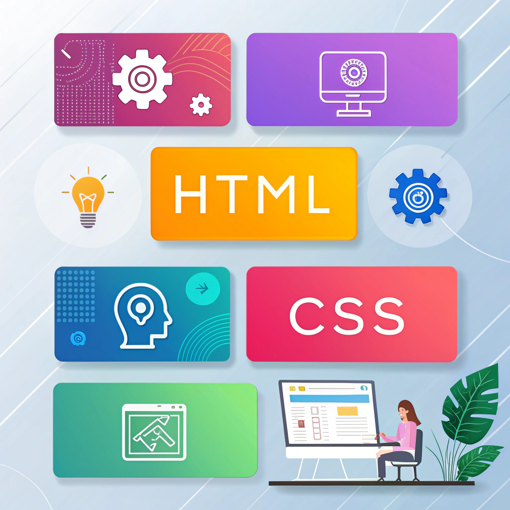
HTML and CSS are the backbone of modern web development. Mastering HTML & CSS snippets allows developers to create websites faster, reduce repetitive coding tasks, and streamline their workflow.
These snippets are small, reusable blocks of code that save time, prevent common errors, and serve as building blocks for any project—from personal portfolios to full-featured websites. By practicing with these examples, both beginners and experienced developers can build responsive, visually appealing, and interactive websites efficiently.
In this guide, we’ll explore layout snippets, buttons and hover effects, responsive design techniques, and a mini project idea to apply these concepts in practice.
Layout Snippets
A clean, well-structured layout is crucial for a professional-looking website. Here’s a simple HTML structure:
<div class="container">
  <header>GitHubEducation</header>
  <main>Content Here</main>
  <footer>© 2025</footer>
</div>
Tips for Layouts:
- Use semantic HTML elements (
<header>,<main>,<footer>) to improve SEO and accessibility. - Add classes or IDs for flexible styling.
- Use Flexbox or CSS Grid for responsive layouts.
Additional Grid Layout Example:
<div class="grid-container">
  <header>Header</header>
  <aside>Sidebar</aside>
  <main>Main Content</main>
  <footer>© 2025</footer>
</div>
Grid layouts provide precise control over element placement, making complex, responsive designs much easier to manage.
Buttons & Hover Effects
Buttons are key interactive elements in web design. Here’s a basic CSS snippet:
button {
  padding: 10px 20px;
  background-color: #008CBA;
  color: white;
  border: none;
  border-radius: 5px;
  cursor: pointer;
  transition: background-color 0.3s ease;
}

button:hover {
  background-color: #4CAF50;
}
Extra Examples:
button.secondary {
  background-color: #f44336;
}

button:disabled {
  background-color: #ccc;
  cursor: not-allowed;
}
Best Practices:
- Use hover effects to enhance user experience.
- Maintain consistent button styles across the site.
- Add smooth transitions for visual appeal.
- Ensure buttons are accessible and properly labeled.
Responsive Design
Making your website mobile-friendly is essential. Here’s a basic media query snippet:
@media (max-width: 768px) {
  .container {
    flex-direction: column;
  }
}

@media (max-width: 1200px) {
  .container {
    padding: 20px;
  }
}
Tips for Responsive Design:
- Use Flexbox or CSS Grid for flexible layouts.
- Prefer relative units like
%,em, orreminstead of fixed pixels. - Test your website on multiple devices and browsers.
- Start with a mobile-first design for better usability and SEO.
Mini Project Idea: Personal Portfolio Website
Apply your HTML & CSS snippets in a real project by creating a personal portfolio website.
Project Requirements:
- HTML for structure: header, sections, footer
- CSS for styling: buttons, fonts, colors, hover effects
- Responsive design using media queries
Steps:
- Create a header with your name and navigation links.
- Add sections for skills, projects, and contact info.
- Style buttons and interactive elements with hover effects.
- Make the site fully responsive using media queries.
- Optionally, add CSS animations or Google Fonts for a modern touch.
This project consolidates your knowledge of layouts, styling, and responsive design while giving you a real-world example to showcase your skills.
Common Mistakes to Avoid
- Using fixed widths instead of flexible layouts.
- Ignoring mobile responsiveness.
- Overusing inline styles instead of external CSS.
- Forgetting semantic HTML for SEO and accessibility.
- Neglecting hover and focus states for interactive elements.
Conclusion
Using HTML & CSS snippets helps you work faster, avoid coding errors, and create professional, interactive websites. From layouts and buttons to responsive design and mini projects, these examples provide a strong foundation for modern web development.
Start experimenting today, expand these snippets into your own projects, and elevate your web design skills!
Internal Links:
External Links:
